pNet / OWN PROJECT
The pNet website: from brand direction to repeatable pages
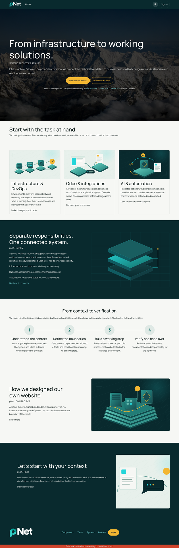
A look at our own digital brand and multipage prototype. No invented client or growth figures: the task, decisions and actual boundary of the result.

The task
Bring infrastructure, Odoo and automation into one understandable offer while allowing a client to start with a single task. The website needed to be expressive, substantive and suitable for later construction in Odoo’s editor. Russian, English and German were part of the brief from the start.
The visual decision
The comparison led to Manrope and the upright pNet wordmark. Turquoise gives the graphics their character; amber identifies the primary action; light surfaces support reading. Following owner feedback, technical illustrations were added to text-heavy blocks. Steps explain the work, diagrams show relationships and the landscape sets the opening mood.
Keeping the system coherent
Pages use shared templates and language data. Images are separate from translatable text. Each major block has a visitor question, purpose, action and proposed Odoo foundation. Documentation places visual examples beside their rules instead of relying only on a single overview sheet.
Evidence of the result
The deliverables include an HTML prototype, standalone SVG and PNG assets, page captures, editable copy, build instructions and browser-check reports. Checks cover navigation, narrow layouts, font loading, form states and package integrity. These are inspectable project artifacts, not claims about business performance.
The boundary
The first deliverable was a standalone prototype. Since then, pNet has implemented and accepted its English homepage in development-01 using the installed theme_pnet_website and native Odoo Website Builder. The seven-page expansion and ordinary-editor create/edit/duplicate acceptance remain in progress. This is a development result: production publication and public enquiry delivery are not claimed.